
Back in Summer Branding Camp we talked about how to choose the right fonts for your brand and if you were around back then, you may remember a Facebook Live I did in my Branding Facebook Group around this topic. So since we’re rounding off font week in Winter Branding Camp, I wanted to start things off by doing a little Part 2 to the original post so that we could pick off where we left in terms of learning how to use fonts.
You have the font names, you have the color codes, but you still struggle because you don’t know how to arrange the fonts and apply the colors so that your site & graphics look like a branded family.
I used to see a lot of my clients struggle with how to use their new fonts after I handed over their branding files because no matter how much they rearranged them or recolored them in their Pinterest graphics, they never could get them to look as professional & cohesive as the rest of their shiny new website design.
Take a look at the images below. Both use the EXACT same fonts, as well as the same exact color palette from a client’s brand.
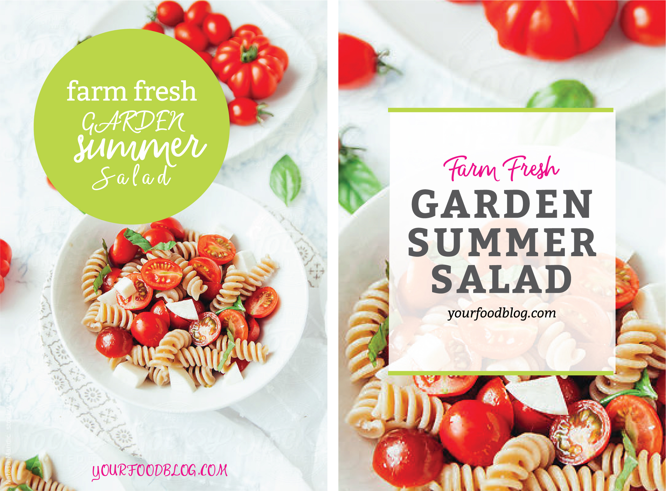
Which one looks more professional and eye-catching to you?
Did you say the one on the right?
If so, you just saw firsthand that by arranging the typography differently and following some basic design principles, one has more impact and looks more professional (while the other contains a few typography mistakes that I see a lot of on Pinterest).
Just like my clients, knowing how to properly arrange the fonts is just as important as having the font names and color codes.
So today we’re going to run through 3 examples of typography mistakes I see most often on blogs and while I’m doing that, I’ll be hitting on some basic font principles to keep in mind.
In this example, I’m going to be using past client, Sara’s, branding as part of this demo. All these images are things I mocked up for the purpose of this tutorial, so when I refer to the “wrong” example, just know that it’s not actually something Sara made. These are all graphics that I intentionally screwed up to show you the mistakes I see most often.
Related Post: How to Choose The Right Fonts For Your Blog Graphics
So let’s get started!
Example #1:
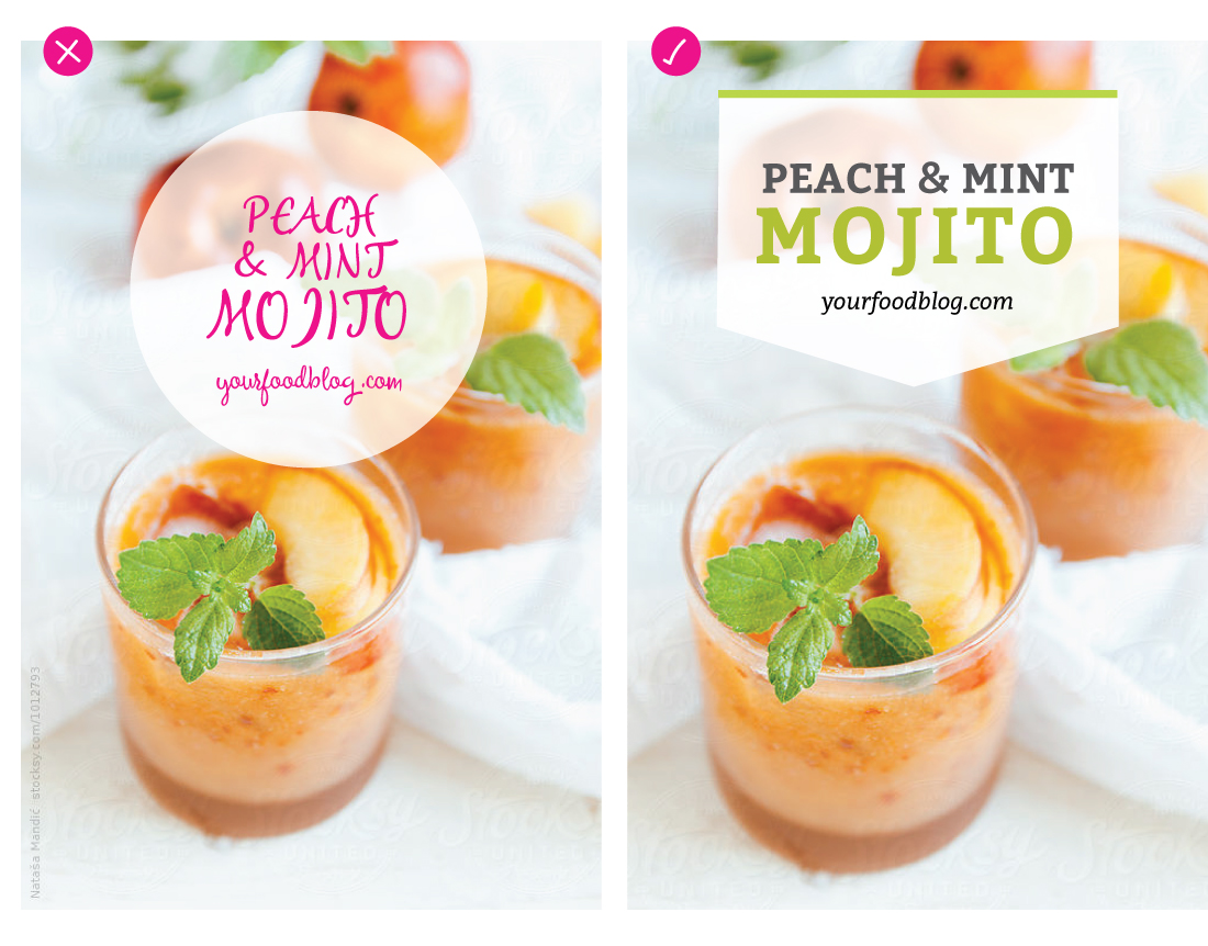
Mistake: Using Script Fonts in All Caps
This first example is something I see a ton on Pinterest graphics that may be hurting the readability of your graphics.
The issue? Using script fonts in all caps, as well as using fonts that are too embellished for headings resulting in the post name getting lost in translation.
Solution: If you use a cleaner, more legible font it will jump out more when people are scrolling through. So if you are using a script font I suggest keeping it in normal case.
Tip: If your logo uses a script font, I recommend only using it for your logo or minimal accents on your blog graphics. You want your logo to stand out and if you have it alongside too much text of the same font, it can lose its uniqueness.
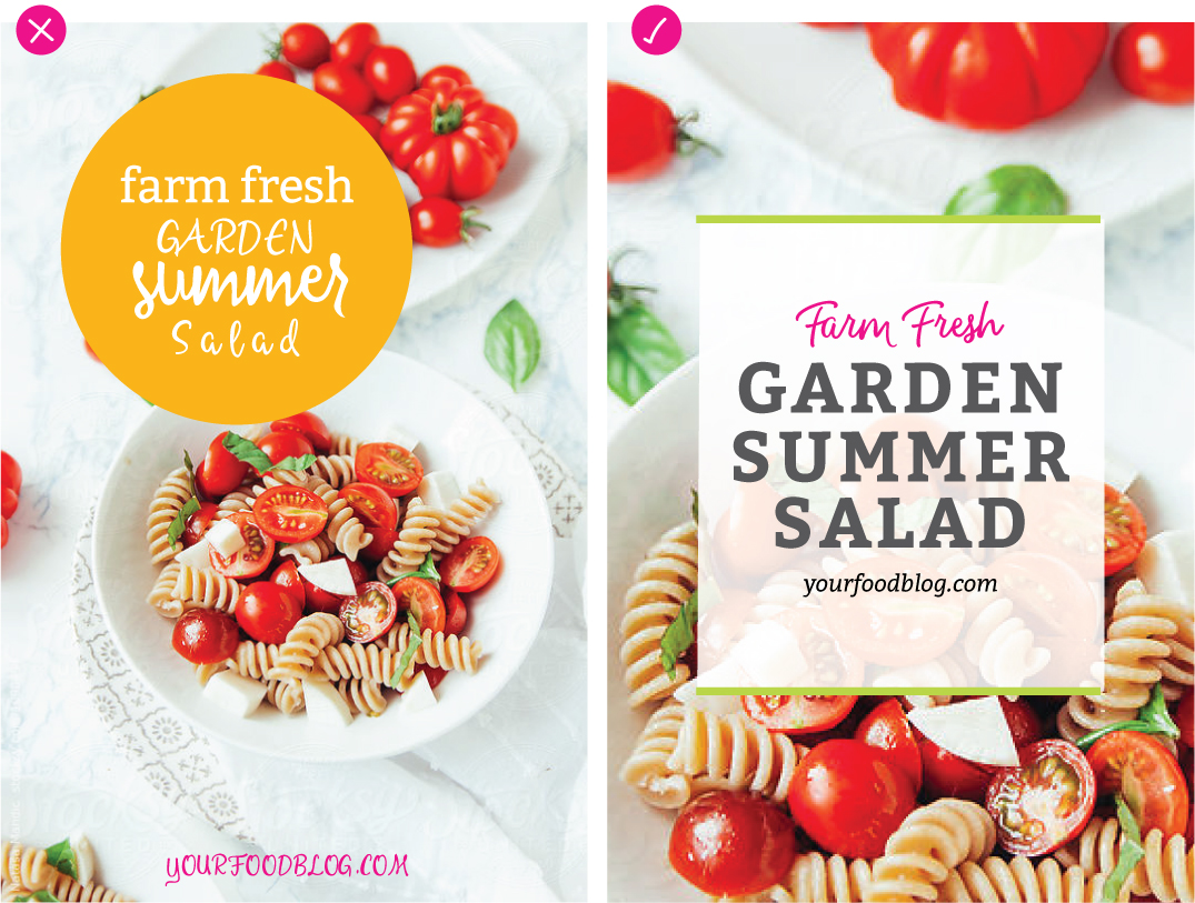
Mistake #1: No Hierarchy in Words
This graphic doesn’t have any hierarchy. It doesn’t tell the person scrolling by in .2 seconds what the most important word is. So by picking the most important words and making them bolder & bigger, I can clearly see that this is a Garden Summer Salad.
Mistake #2: Spacing Out Script Fonts
The other issue with the image on the left is that it uses too many variations of fonts. It not only uses the script in all caps, but I don’t know whether “farm fresh” or “summer is the most important, because those are the two boldest and biggest words.
So by using the script font as more of an accent and giving the most important words hierarchy, you will help people know exactly what they’re getting when they see your image. You want people to see the main selling points to the recipe first.
Example #3:
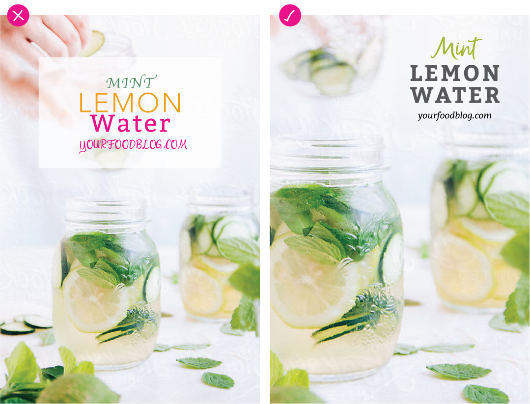
This last example I want to show you is one that breaks all the rules.
Mistake #1: Using a Non-Brand Font
1. It uses all caps scripts (which we talked about in #1 above).
Mistake #2: Too Many Fonts
2. Instead of using the fonts in the branding, here I’m just using a random font for the word “Mint” because it feels rustic like the photo. I see this a lot with bloggers bringing in random fonts, and while they might not hurt the pinnability of things, the inconsistency is going to make it hard for people who may be familiar with your site to recognize your image because it’s not branded.
To create a well recognized look, you want to be consistent with the fonts you use.
Mistake #3: No Hierarchy
3. The last issue with this is that It doesn’t have hierarchy. So naturally the eye is drawn to the biggest & boldest word on there which is “Water” instead of the word “Lemon Water”. But if you change both words to carry the same weight, you can clearly see what the main purpose of the post is.
So to sum it up, to create well branded graphics that catch people’s eyes you want to:
1. Define your fonts and stick with them (i.e. create (or have created) a Style Guide for your brand)
3. Don’t use script fonts in all caps
2. Choose the most important words and give them the most hierarchy in terms of Size and Weight. So the main part of the post should be the biggest and boldest.
4. If your logo contains a script font, use that minimally throughout your graphics in order to allow your logo to stand out.
I hope this post was helpful in learning a little more about fonts & how the different ways you use them can affect how strong your branding will look. I know a lot of bloggers struggle with defining their brand’s aesthetics and I’ve been toying with the idea of creating some type of class where I’d work with 20-ish bloggers to help walk through the process of creating a solid Branding Style Guide. If this is something you may be interested in, add your email below to be updated on the status of that.
Announcement: The Real Food Dietitains was named a top 10 best website design in Design Rush’s Top 10 Wellbeing Website Designs.
Share on Social