
Today’s post is brought to you by my development partner Lauren over at Once Coupled. Lauren is not only the mastermind pixel-perfect coder behind my custom site designs, but she specializes in site speed for bloggers. And lucky for you, Lauren is here to share some of that knowledge on site speed to help you best set up your images.
[line]
Image sizes are a HUGE question right now. Seriously, Once Coupled gets them all the time – during speed audits, while developing custom themes, and on forums and Facebook groups.
After performing over 100 site speed audits and pulling sites from red & yellow PageSpeed Insights scores up to green, we can confidently say that for many bloggers images are the single biggest change you could make to your site speed. Whether it’s decreasing their pixel size, compressing their file size, or both, improving your site’s images will make your users (and Google) love you.
Let’s focus on the former – the actual size of the image – because too-large images aren’t going to keep your site from green, even if they’re compressed. (Plus, if you have to create some new image sizes they’re going to need to be compressed, so you might as well do that step second.)
What does it mean to have “perfectly-sized” images?
An image is the “perfect” size if its size matches the size of its container. That is, if the image isn’t too big or too small for the area you’ve placed it in.
This can be a little difficult to identify because your theme will automatically scale down images that are too large. Those images will appear to fit perfectly within their container and, depending on the computer’s screen, may even look crisper when doing so.
Why would you want images to be a certain size?
When an image is too big, your readers are loading a larger image than necessary, which takes more time.
When an image is too small, it may make a site feel “uneven” or “messy” and won’t look as crisp as possible on high resolution desktop screens (which means most MacBook users are going to notice the difference).
The goldilocks of image sizes will satisfy both your inner perfectionist and your readers’ need for speed – not without a little bit of extra work, though.
How can I tell if my images are right size?
When we say an image is the “perfect” size, how do we know what that size is? What can we use to measure this? And what extra factors do we need to be aware of?
An image is ideally the same size as its container, so the first thing you’ll want to do is determine the size of the container you’re adding your image to. In most cases, that’s going to be your post content – so that’s the container width you want to know.
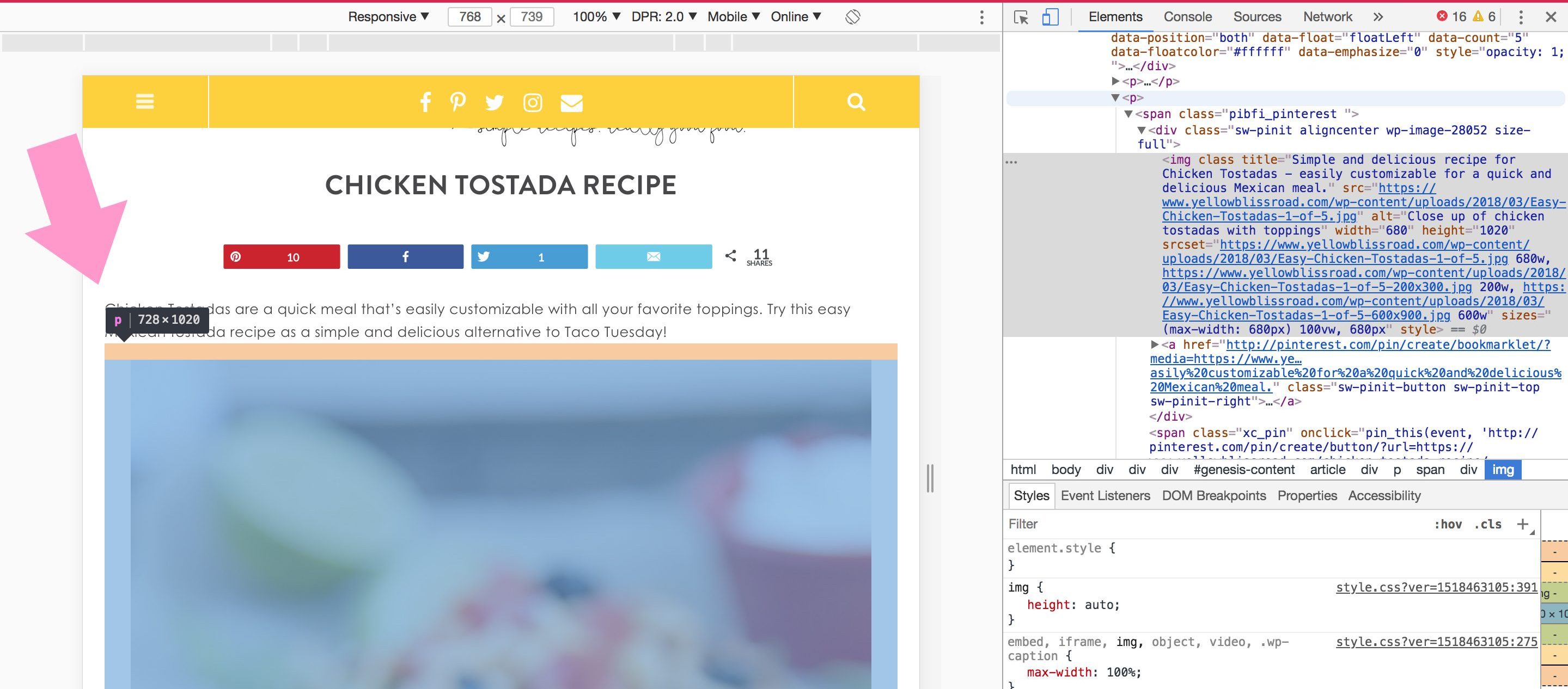
The images below show how to get the size of this container using Chrome’s browser inspector tools:
Step 1: Right-click anywhere in your content and select “inspect” from the context menu.
Step 2: Enable select mode by clicking the icon at the top-level of the browser inspector (it looks like a box with a cursor in it).
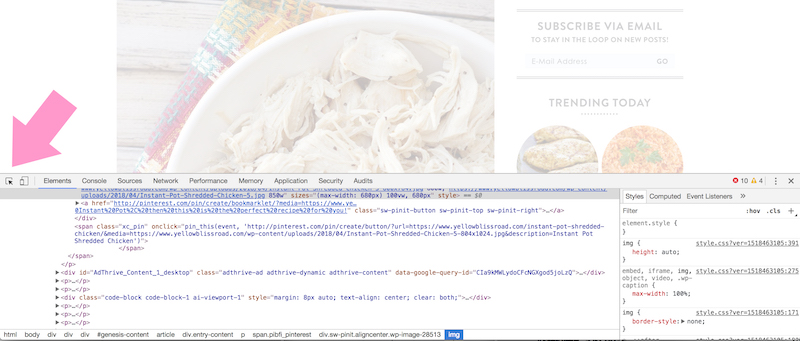
Step 3: In this mode, you can hover anywhere on the page itself and Chrome will highlight that element, showing you the dimensions of it.
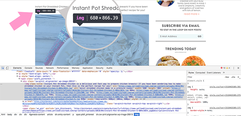
In step #2 or #3, the first number will be the width, the second number the height. Since the image’s height will scale (proportional to the width), we only need to worry about the width. When inserting an image in your post content, the width value you just found is that perfect size we’re aiming for!
In the screenshots above, the width was 680px. For example purposes, this value will be used throughout the article. Keep in mind that your content width may be different, however, and you can use the above screenshots to help you find it.
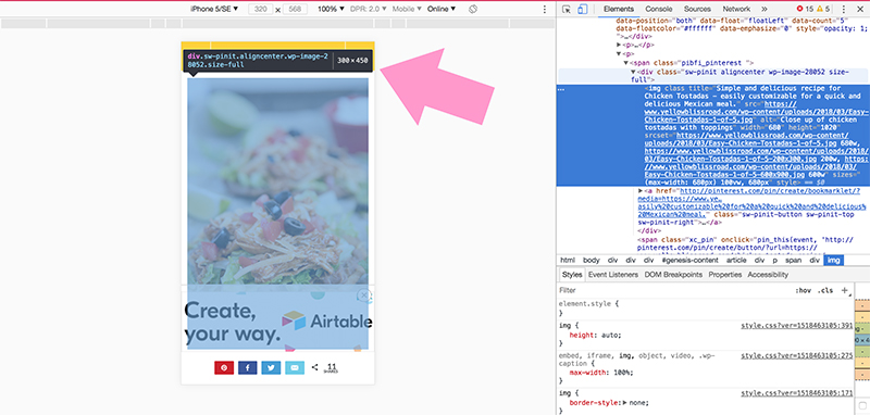
There is a catch, though: this container’s size is going to change for different screen sizes and the number of changes will depend on the theme. For example, here’s the size of the same container, on the same site, at two additional screen sizes:
On screens 768px wide (some large phones or small tablets), the content area is 728px.
On screens 320px wide (small phones), the content area is 300px.
Without getting into too much detail, I recommend optimizing your images for the 1024px screen size, which is going to include tablets and smaller computers. It’s also the size that Google’s PageSpeed Insights tool currently uses to measure their desktop scores. Note that while we usually worry about mobile first, most WordPress images are automatically mobile-optimized thanks to srcset. This has been added to WordPress core and is automatically enabled, so you’re already reaping the benefits of it, as long as you haven’t asked your developer to manually disable it.
Three ways to get the perfect image size.
There are two different ways images are inserted onto your site:
1. You insert them into the post content, probably at the full size.
2. Your theme inserts them into your sidebar, footer, or page template using a “thumbnail” size.
In this article, we’re specifically covering the images that you’re uploading and inserting in your post content.
Depending on the way they’re inserted, you’ll want to use a different method:
1. Upload them at the perfect size.
In this method, export new images at exactly the width of the content area. In our example above, that was 680px. Now when you insert them at full-size in your post content, they’re already the perfect size.
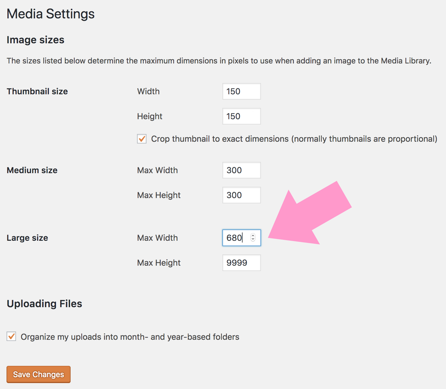
Step 1: To find your image settings, log into your WordPress and navigate to Settings > Media. Set the width to the value you found for your website and the height to 9999, so the image is always limited by the desired width.
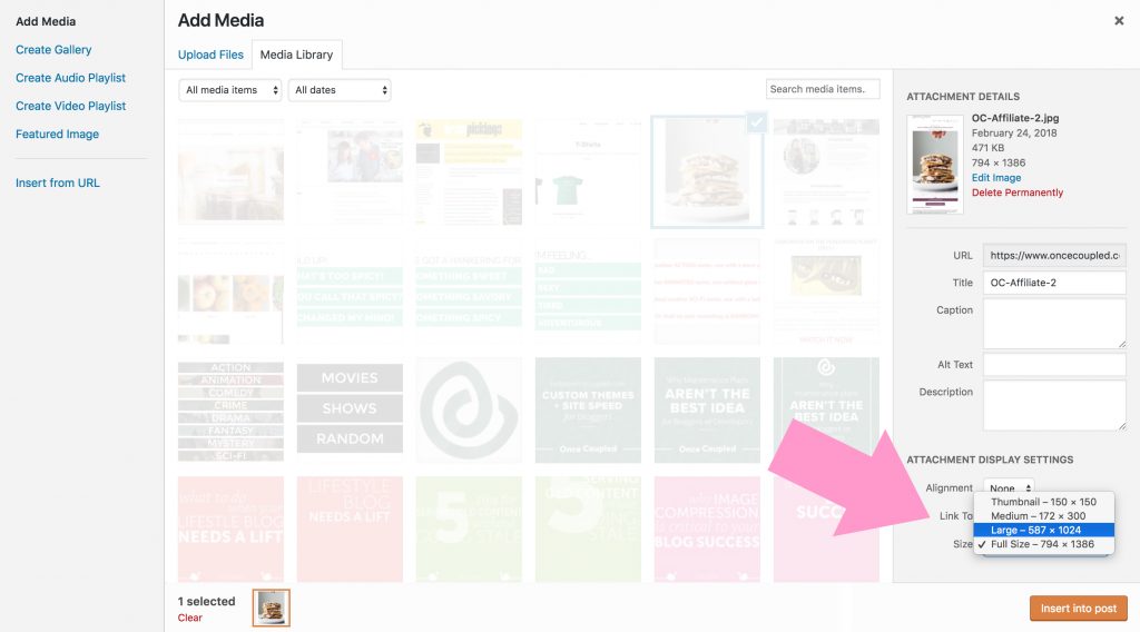
Step 2: When inserting your image, choose “Large” from the drop-down menu. (Note that I did not actually change my image settings, so the pixel values shown do not match the example used in this article.)
Pros
- This “just works,” making it a no-fuss way to improve the size of your post images.
- No tech knowledge required!
Cons
- Users visiting your site on desktop, using a retina screen, will notice the image is not as high-quality and crisp as it could be. Luckily, this likely a very small subset of your readers.
- If you change to a theme will a larger content area in the future, your images won’t fill the entire content area any more.
- Older posts will need to be manually updated.
2. Take advantage of WordPress’s built-in image settings.
In this method, set the width of the “Large” image size to your content width, then upload images at twice this size. When you insert your image into the post content, choose to do so at the “Large” size. This will insert the perfect image size while automatically supporting retina, thanks again to srcset.
Pros
- Images are the perfect size.
- They look great on retina and non-retina devices.
Cons
- If you need to regenerate plugins in the future, make sure you don’t use a plugin that deletes old image sizes, since they might delete image sizes that have been inserted in your post content.
- If you change to a theme will a larger content area in the future, your images won’t fill the entire content area any more.
- Older posts will need to be manually updated.
3. Ask your developer to develop your theme with srcset in mind.
We’ve mentioned srcset quite a few times now, always in a positive context. That’s because srcset is a feature that allows you to specify multiple sizes for a single image, only showing the “best” size to the visitor. That is, when a user visits your site, their browser will read that list and download only the size that’s most relevant to them. WordPress has some support for this by default (that’s actually how the previous solution works), but this functionality can be greatly extended and improved upon by the right developer. For it to work on your older posts, some custom rules will need to be added to your theme.
Pros
- You do absolutely nothing different. (Upload giant images, live your life!)
- Works in older posts.
Cons
- Difficult to set up.
- Uses a lot of thumbnails. These have to be stored on your server, which can increase hosting costs. Compressing more thumbnails also requires more credits, which can increase subscription costs.
Closing notes
Images can hugely impact site speed. While we didn’t cover them in this article, image thumbnails used in widget areas and plugins are frequently oversized, too. It can feel overwhelming to fix them all at once, but if we start by understanding how to size them, we can begin by fixing images for new posts only. After that, go back and update your top 10-20 posts.
Over time, we’ll see more themes and plugins prioritize speed and image automation, making your job easier. Melissa Rose Design and Once Coupled are leading this initiative through our Limited Edition theme.
Share on Social